Showing posts with label Survey. Show all posts

Saturday, February 27, 2010

Wine Tasting: Testing Perception vs. Reality

The other night I had a small get together at my place. The theme of the evening was wine and cheese. I had decided to coordinate a wine tasting, so I gave my guests six different varieties of wine that I wanted them to sample.

However, I also thought this would be a phenomenal chance to collect some interesting data. What possible data could I collect during a wine tasting?

Well, I thought it would be particularly interesting to see if people could predict the value of a wine based on its taste without being told its value ahead of time. Though I am certainly no wine expert, I find it very challenging myself to distinguish whether a wine is "expensive" or "cheap".

But then again, I am just one person. There is evidence that suggests that there is some sort of wisdom that is inherent to a crowd. An entire book was actually written on this subject.

So, what would happen if you put a crowd of people together with six somewhat arbitrary wines and asked them to taste them and predict how much each cost? Would they be able to predict the value of the wine on average or would they be just as clueless as I am?

Motivated by seeking out the answer to these questions, I organized my wine tasting party - for social purposes and for science purposes!
  • The Wine Tasting
My data set is made up of 10 participants. During the wine tasting, participants were given the option of filling out a survey that I had prepared for them. The survey consisted of an empty table that allowed participants to fill in with values.

The first column on the survey table indicated the number wine that each row in the table corresponded to. Wine numbers were listed along with actual wines that could be tasted, and participants were responsible for putting their predicted value for each wine with the correct wine number on their surveys.

There is a chance then that some data points could have been marked incorrectly, but I do not foresee this altering the data significantly.

The data table was also made up of a nominal value ($) column in which participants would place their predictions. To the right of that column was a Location column, which was used as a dummy variable (but also interesting). Finally, participants could also rank their wines and write notes in the right-most column. Figure 1 depicts the survey before it had been filled out.

FIGURE 1

Each participant was uniquely identified by an ID that was written on the back of the survey. IDs were randomly assigned before the wine tasting party commenced. The unique IDs are given in figure 2.

Each column in figure 2 labeled "Wine _" represents a different wine variety and value. It goes from "Wine 1" to "Wine 6" when scanning the table from left to right.

The mean, median, and mode of the individual's responses are calculated at the bottom of the table and are labeled as such in the left most column. Finally, at the very bottom of the table is the actual value of each wine. The listed values are in currency units which are not depicted in the table. The currency is 2010 US Dollars.

FIGURE 2

The most significant comparison that I wanted to make was between the mean (the average) predictions of the group against the actual value of the wine. Comparing the average predicted values with the actual values effectively tests my general question regarding how perception coincides with reality (at least with the value of wine tasting).

I have depicted the average predicted value versus the actual value in figure 3. The x-axis is segmented by corresponding wine number and the y-axis is the value of the wine in 2010 US Dollars.

FIGURE 3
  • Discussion
Taking a look at the data, I am quite impressed with how the group performed. If we take a deeper look at figure 3 and qualitatively describe it in terms of the general trend, I see that as actual values fall so do predicted values, and as actual values rises, so do predicted values. This is strong evidence to suggest that people, on average, can distinguish the value of a wine simply via taste.

If we compare Wine 1 to Wine 2 for instance, we see that the actual value declines by 35% while predicted value similarly declines by 55%. While the degree is comparatively larger in the decline of the predicted value, the overall trend of rising or falling value is remarkably similar and is the case for five out of the six wines.

I think that even beyond predicting actual value of the wine, this trend following of the actual value of the wine is striking.

The only wine for which this was not the case was the final wine sampled, Wine 6. Wine 6 was in fact the least "valuable" wine but was ranked as the second most "valuable" wine. I think that this was the case because of the cognitive bias of anchoring. The most valuable wine, both actual and predicted, was sampled just prior to having the sixth wine and this anchor may have biased the participants overall when making their predictions of the value of wine 6.

Overall, it was a pretty rad wine tasting party and I think fun was had by all.
  • Summary
Participants were asked to predict values of different wines. On average, the group of participants was able to fluctuate their wine prediction in tandem with the actual value of the wine in all but one case. The results indicate that a group of individuals are able to discern the nominal value of a wine simply based on taste.

Tuesday, June 2, 2009

Trading

Several weeks ago I ran a survey through Those Answers Inc. which sought to look at the correlation between a person's likelihood of investing in the stock market if they engaged in a market based system in their younger years, trading cards.

The first thing to address when tackling this question is to define what a market is. A market is merely just a conceptualized form in which one good or service is traded for another good or service. There are countless forms of markets in today's modern world. There are more formalized markets like the stock market or the currency market or the futures market. But then, there are also far less formal markets, such as a yard sale or craigslist or even kids trading baseball cards (or any sort of cards) on the school yard.

The purpose of my survey was thus to verify whether informal markets had the propensity to lead to individuals partaking in formal markets. The particular type of informal market that I studied was the last example that I gave, that of young children trading cards with one another, and the formal market that I hoped to correlate these findings with was the stock market.

The underlying theory that gives me reason for this connection to exist is based on socialization. Sociologists use this terminology in order to describe the "process of learning one’s culture and how to live within it" (Source). I think that bartering is a human behavior that individuals must learn in order to survive. Therefore, I gathered that if individuals were exposed to market environments at a younger age in an informal setting, they may be more likely to participate in markets when they are older through socialization and conditioning.

It also may be more natural and intuitive for individuals to participate in formal markets when they have already taken part in informal markets.

That was the first objective of the survey I gave. The second objective was to seek out something far more psychological about the thought processes of individuals partaking in formal markets based on their socialization from informal markets. I sought to find whether or not individuals were likely to hold similar beliefs about the value of items with the influence of time.
  • Results
The results are based on the survey results of 34 respondents. 19 of the 34 (56%) of the respondents were male and 15 of the 34 (44%) were female. The average age of a respondent was 22.6 years and ranged between a low of 19 years and a high of 42 years.

The first thing that I wanted to know from my survey participants was whether or not they had ever collected any sort of trading card. 65% of individuals (22 of 34) said that they had collected some sort of trading card.

Then I wanted to see whether the intent of the individual collecting the trading card was similar to the intention of formal market speculators. The way I did this was to ask whether the individual when collecting their trading card anticipated selling that trading card at a later date.

The answer to this question reveals a great deal about human behavior psychologically and culturally. A high percentage of individuals willing to sell their trading cards at a later date indicate that people instinctively collect belongings recognizing that they will part with them at a future date. This seems odd doesn't it? If I know that I am going to have no use for a particular item in the future, what is my motivation to horde that item now? I think intuitively it comes down to exclusivity.

When an item is highly desirable and highly exclusive the value of that item is inflated. This isn't because the item itself has gotten any better, but rather, the psychological drivers of desirability and exclusivity make an individual perceive a particular item to be more than it is worth. It is based on this premise that people will opt to collect items today in hopes that their perceived value will be greater later on (in effect, attempting to horde an item that has "stable" value, money).

Of the surveyed individuals, 63.6% (14 of 22), anticipated selling their trading cards at a later date.

Next, I wanted to figure out what those individuals who anticipated selling their trading cards at a later date thought would happen to the value of their trading card over time. I gave them the option of the value increasing or decreasing over time. A staggering 100% (14 of 14) believed that by adding time to the equation, the value of their item was surely to increase.

This reveals something quite compelling about the natural tendency of individuals partaking in informal markets. It illustrates that perceived value over time increases. If this is instinctive in informal markets, can the same be said about the value over time of objects in formal markets? If the socialization effect appears to hold, this could be a reasonable deduction to make.

Now, I began my inquiry into the interaction with formal markets of our surveyed participants. I asked respondents if they had any capital invested in the United States stock market (our formal market).

Out of all respondents, only 38.2% (13 of 34) had money currently invested in the stock market as of May, 2009. According to 2002 data by the Investment Company Institute, 35.9 million households, which represent 33.7% of the households in the United States owned either stocks or mutual funds or both (Source). Based on the close proximity of these two percentages, I can conclude that we are looking at a pretty representative sample of the United States stock ownership community.

This is where I can finally get at what I was really after. At this point, I can determine if there is a significantly higher percentage of individuals who traded cards when they were younger (in informal markets) who participate in the stock market (our formal market).

In order to perform my statistical tests, I used a one-proportion z-test for the four particular conditions that I had. The first condition was yes informal - yes formal (YIYF), the second was no informal - no formal (NINF), the third was yes informal - no formal (YINF), and the fourth was no informal - yes formal (NIYF).
  • YIYF
After conducting the one-proportion z-test for this condition, a z-value of 0.55 was achieved which has a p-value of 0.2088. This is not considered a statistically significant value, and thus one cannot conclude that if an individual was involved in informal markets then that would predict for their involvement in formal markets. (A larger sample is needed to truly verify this result).
  • NINF
A z-value of 3.4 was achieved which has a p-value of 0.0003. This is considered a highly statistically significant value, and thus one can conclude that if an individual was not involved in informal markets then that would predict for their non-involvement in formal markets. (A larger sample is needed to truly verify this result).
  • YINF
A z-value of 2.27 was achieved which has a p-value of 0.0119. This is considered a highly statistically significant value, and thus one can conclude that if an individual was involved in informal markets then that would predict for their non-involvement in formal markets. (A larger sample is needed to truly verify this result).
  • NIYF
A z-value of -0.59 was achieved which has a p-value of 0.7224. This is not considered a statistically significant value, and thus one cannot conclude that if an individual was not involved in informal markets then that would predict for their involvement in formal markets. (A larger sample is needed to truly verify this result).

These findings truly get at the crux of the survey. It appears as though there is no correlation between involvement in informal markets and formal markets.

The survey also sought to verify whether the beliefs held about perceived values were still consistent between informal and formal markets. Recall that in informal markets individuals believed, with a 100% success rate, that the value of their good would increase over time. When it came to formal markets, it appears as though beliefs mirror that of the informal market. 92.8% (13 of 14) respondents believed that the value of an investment is likely to increase rather than decrease over time.

This seems to be highly correlated. Beliefs seem to remain embedded regardless of the market type, and that belief is that value increases over time.

With the belief structure that value tends to increase over time it was not that surprising to find that only 59% (20 of 34) of respondents knew the difference between a long position in the stock market and a short position. Long positions are based on the belief that investments will increase, whereas, short positions take the stance that investments will decrease. A short position is probably counter-intuitive to a lot of people's thinking based on the results of this survey.

Thanks to all participants!

Tuesday, April 7, 2009

iTunes Play Count

I recently ran a survey on Those Answers in order to measure how accurate the number one played song on an individual's iTunes reflects that persons preference for their current favorite song. There are several reasons that drew me to make this conclusion and thus seek out the necessary data to verify it.

First, I considered that when people enjoy something, they tend to expose themselves to it more. For example, consider a person who is a vegetarian. This person has consciously made the choice to not eat meat. They might choose to do so because they are against animal cruelty, are trying to save the environment, or are just opposed to the taste of meat products. As a result, they don't expose themselves to any meat.

I feel like this is true for most other things in a person's life. If they enjoy it, they will continue to expose themselves to it, if not, they will likely avoid it all costs. Therefore, a person would probably choose to expose themselves to their favorite song as much as possible, thereby increasing the number of play counts on their iTunes.

Second, I consider the psychological theory of the mere exposure effect. This theory states that as an individual is exposed to a stimulus more and more, they will gradually begin to like that stimulus. This reasoning is the reverse-logic of my first point, suggesting that exposure drives favoritism, rather than favoritism driving exposure.

I ran this survey without the intention of determining which principle is truly driving the amount of times a song is played on iTunes, but rather to check whether the top song played on a person's iTunes is in fact an individual's favorite song. In order to test either of my inferences about iTunes, I needed to determine whether if the top played song was in fact a favorite for people on average.

The results that follow provide both a visual and analytical attempt at answering the question: Is the number one played song on iTunes considered a person's current favorite song, on average?
  • Results
The results are based on the responses by 61 participants. 28 Females, 32 Males, and 1 Unidentified. The average age of a respondent was 21.24 years with a standard deviation of 3.82 years. The youngest respondent was 14 and the oldest respondent was 45. The data was compiled between March 3, 2009 and March 8, 2009.

Respondents were first asked to sort their iTunes so that it was ranked by Play Count, which is easily ordered by clicking on the tab at the top of the iTunes program. Participants in the study were asked to list the artist and the name of the song that came up as their most frequently played. The list to the left summarizes the 61 respondents' songs and artists that are the most frequently played song on their iTunes.

I'd like to point out the diversity in music tastes exhibited by this list. There is only a few artists that are featured more than one time. These include: Radiohead, Jack Johnson, Wilco, and The Fray. Part of my motivation to perform this survey was to increase the variety of music I am exposed to, and this list certainly has helped.

Following these questions, I found out how many times the individual had played their number one song. Respondents averaged 90.51 times played for their number one song on iTunes. This had a standard deviation of 91.80, with a high of 465 times played and a low of 5 times played. The median was 67 times played. With these amount of times played, on average, I think that this sample is pretty generalizable. I recognize that some people listen to their iTunes and music a lot more than others, but there is a wide diversity in the range of times played, which make the results of this study interesting to a large demographic of people (those who listen to music a lot, and those who do not).

The image to the right reveals a histogram of the number of times the most played song has been played on iTunes. As you can see, the majority of respondents have listened to their number one played song on iTunes less than 150 times. There are some individuals who have listened to their number one played song more than 150 times, but this makes up a vast minority of the respondents.

The next question I ask really gets at the crux of the question that I posed. I asked participants if the number one played song was their favorite song right now. According to the results, only 8 participants (13%), said that the number one played song on their iTunes was their favorite song right now. That is countered by 52 participants (87%) who said that the number one played song on their iTunes was not their current favorite song.
In the previous question to participants, I suggested that the top played song was their favorite song right at this moment. I anticipated that some people may have liked that song in the past, played it a lot, and have perhaps moved on to other musical endeavors. Therefore, I also asked if this song had ever been their favorite song in the past. The following graph reveals that there is a general spread as to when people liked their number one played song on iTunes.

There certainly isn't any prevailing time period at which this was their favorite song. It is important to note, however, that five individuals stated that they actually never liked their top played song on iTunes. There is a minor trend to take away from the respondent's answers; that being that the song that is most played was their favorite sometime within the last year. A good majority of participants agreed that this song was their favorite at some point within the last year.

I was also curious as to where the top played song on a person's iTunes ranks in terms of their all time list of favorite songs. This question gives participants a wider degree of freedom in terms of how much they enjoy their top played song on iTunes. Only a small number of individuals revealed that their number one played song on iTunes was their favorite. An even larger number revealed that they didn't even like the most played song on their iTunes.

A majority of respondents ranked their top played song on iTunes as one that would fall in their top 25 favorite songs of all time. There was also a relatively high frequency of individuals who ranked their top played song on iTunes as one that merely falls within their top 100 songs of all time.
Finally, respondents were asked to list characteristics about their second most played song according to their iTunes Play Count. The second most played song was played on average 70.14 times with a standard deviation of 70.08 times played. The most amount of times the second most played song was played was 380 and the least amount was 4 times played. The median amount of times the second most played song was played was 56 times.
Respondents were then asked to make a determination about whether they considered their number one or number two played song on their iTunes their personal favorite. This is another very good way of measuring the extent to which the number one played song is the current favorite of the person being surveyed. The results indicate an almost perfect split. 31 of the 61 participants (51%) indicate that their favorite song of the two is the most played song on their iTunes. This means that the other 30 participants (49%) chose their second most played song on iTunes as their favorite song.
  • Conclusion
The purpose of this survey was to test the validity of the Play Count function on iTunes as a measure of an individual's favorite song. According to the results, this measure's validity seems unlikely.

Only 13% of individuals considered their number one played song their current favorite. Additionally, when individuals were given the opportunity to decide between their most played song and second most played song on iTunes, the preference was almost perfectly split, which does not suggest that the top song on iTunes necessarily holds any extra clout in measuring a person's favorite current song.

However, the number one played song on an individual's iTunes may suggest certain generalizable attributes. First, it appears as though the most played song was the individual's favorite song at some point, but not necessarily at the present time. Additionally, the most played song on an individual's iTunes at least makes the top 25 list of all time favorite songs for a majority of people.

Though, I cannot assert that the most played song on iTunes is an individual's favorite song now, it certainly can indicate the musical preference of that individual at some point in time.

Wednesday, March 11, 2009

Bar Lines

Recently, I surveyed several college students to get a gauge of how significant the length and time involved in waiting in line to get into a bar is on people's preferences to go to that bar. I think that there are implications for bar owners and the people who work their doors in order to maximize positive feelings relating to their bar, even if only from the experience of waiting in line.

My findings suggest that people are most definitely waiting in line and have a threshold in terms of both people waiting in line and time devoted to waiting in line at which a person becomes deterred from the establishment entirely. This is obviously on the average and doesn't necessarily explain the behaviors of all individuals, everywhere.
  • Results
The results of the survey are based on 82 respondents. The respondents varied in age from 19 to 27, with a mean of 21.6 years. The respondent's genders were evenly distributed (Males = 41, Female = 40, No Response = 1).

Generally, it appears as though the wait time in lines is generally pretty quick, however, there are some individuals who feel as though they spend lengthier amounts of time in line ranging from around 15 minutes to 25 minutes. These are quite significant time investments in order to experience the inside of a bar. There was no statistical finding that indicated that female respondents wait in line for a different length of time than male respondents, which is surprising.

Here are the results of one of the questions in the survey. It reveals that the respondent's in this survey are definitely influenced by the length of the line in terms of going to a bar. The majority of respondent's indicated that between 20 and 30 percent of the time they would not go to a bar purely based on the length. Several respondent's had even higher frequencies of this preference.

The preceding distribution of respondents is even further warranted by the finding that the length of a line outside of a bar is quite a deterrent to those individuals who would like to attend a bar. Taking a look at the results from this chart, one can see that a majority of respondents felt as though the line outside of a bar to be quite a large deterrent, measuring an 8 out of 10. A very small number of respondents felt as though the length of a line had a small degree of deterrence, heavily outweighed by larger degrees of deterrence.

The importance of the length of a line outside of a bar to an individual also tells an interesting story. Based on these results, it appears as though lines are generally quite important to individuals in evaluating which bar to go to. A high frequency of individuals had this ranked very high in importance, while other individuals had this ranked as only moderately high. However, it is important to note the lack of low importance that a bar line plays in the minds of individuals going to bars. It is clearly something that they think about.

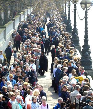
The number of people also seem to have an influence on the willingness of an individual to wait in a line to get into a bar. It appears as though there is a definite threshold at which individuals become deterred from waiting in line based on the perception of how many people are in line. At the point the line reaches 45 people, individuals are just not willing to wait anymore in that line. While the majority of individuals begin to be deterred from a line that has 25 people in it, this is not yet the point at which people completely give up on the line. At 45 people, or at least the perception of 45 people, becomes far too daunting to the person waiting to get in line and he or she thus removes him or herself from it.

People also tend to go to bars mainly because they have friends that are there. As the results of the pie-chart above indicate, a large portion of people choose a bar based on the fact that they have friends there. Other competing elements to this are the atmosphere of the bar and drink specials there.

Finally, I looked into whether or not people were even inquiring about the length or size of a line outside of a bar before even getting to the bar. I feel like this is another suitable gauge of indicating how important the line outside of a bar is in determining an individuals choice and behavior. A large majority (70%) have inquired about the line ahead of time, therefore, suggesting that the line is something that people are thinking about even prior to actually arriving at the bar.

Taking all of these findings together, I propose some thoughts in my conclusion.
  • Conclusion
The length and size of a line outside of a bar has significant influence on our preference to enter into that bar or even wait in line. There are several reasons that draw me to make this conclusion. First, people are inquiring about the size of a line to a bar, either by texting or calling friends already at the bar or in some cases asking cab drivers whose typical routes may take them to and from the bar, which suggests that this is important information in the process of personal decision making. Most people also rank the length of the line outside of a bar as a very important determinant in going to a bar.

Based on the frequency that individuals don't attend bars based on the length of the line alone, it is clear to see that bar line length ought to be considered by management of the bars.

Alternatively, it may be management's prerogative to keep a longer line outside of the bar in order to feign that the inside of the bar is very cool. This adds an element of exclusivity to the bar, which is a concept that I chose not to test in this current survey. Exclusivity is important, perhaps in bigger cities and when individuals have more money to spend, but in a college town, exclusivity loses its appeal the moment people have to wait in line for too long or there are too many people in line to begin with.

There is a tricky balance to be struck by people moderating lines outside of a bar and the choice of management in terms of how exclusive he or she would want the bar to be.

However, there can also be services that bars may want to provide to their customers in order to keep them in the loop as much as possible, seeming though the line is an important determinant for individuals attending bars. Bars could look into broadcasting the length of their line over the Internet and making it extremely accessible via iPhone or Blackberry so that the knowledge can be portable. This will help keep customers informed and content.

Thursday, December 4, 2008

Motive Imagery and The Spread of Ideas

A couple weeks ago I ran a quick survey on my website, Those Answers, in order to gather data about the affect (if any) that motive imagery may play on the spread of ideas. I was interested in finding out if there was one particular class of motive imagery that people are more or less likely to disseminate.

Motive imagery is a psychological phenomenon that is rooted in the Thematic Apperception Test (TAT), in which a person tells a fantastical story about anything or may be guided by the use of images, sounds, or ideas. Based on the language and tones that people use to elicit their thoughts, whether they are stern or sweet, hopeful or sad, angry or happy, can indeed tell you about the current psychological state of that individual.

Motive imagery is then broken down into three core categories (there is actually a fourth dimension to motive imagery, but that will not be explained in this post). The classifications of motive imagery are rather simple, but are phenomenally complex when one explores their intricacies and how they were originally determined.

There is achievement motive imagery, which is based on positive evaluations, a desire to do better, positive goal oriented performance, or unique acts performed. There is affiliation/intimacy motive imagery, which is based on the longing for togetherness, sad feelings about separation, or the desire to help in a genuine way. Finally, there is power motive imagery, which is based on force and regulation and a need to impress others.

Motive imagery was established in the early 1950's by a famed psychologist at Harvard named David McClelland. McClelland asserted that by categorizing and collecting data on these TAT tests, one could establish deep, underlying motivations that people possessed. His work has been built on further by David Winter at the University of Michigan and Richard Boyatzis at Case Western Reserve University.

I am currently conducting an in depth research study on the role motive imagery plays in the corporate world. As I go on this adventure, my mind wanders, and I felt like gathering some data on another aspect of human psychology that motive imagery may be responsible for, and that is the dissemination of ideas.

When people hear information, they need to interpret that information for themselves, process it, store it, and then if they engage in social activities in which they can share that information, disperse it if they decide it is worthy.

I think that the concept of the transfer of ideas is mind blowing. Essentially, an idea is birthed in someone's mind, is uttered in a usable form of language to another organism that can go through the process described above, and then that other organism, feeling so compelled by the information they received makes a conscious decision to seek out and share other organisms with which it can spread the idea or information further.

There is a great deal of relevance to this dissection. In today's world where information is readily available and accessible at all times almost anywhere on the planet (newspapers, phones, Internet, television, etc.), one ought to wonder how human's decide on which ideas are the most pertinent, important, and really, worthy of our own cognitive functioning.

As a result of this inundation of information and knowledge, advertisers and news media have started to rely more heavily on Word of Mouth Marketing (WOMM), which is considered the best form of sharing ideas because it has the greatest impact and lasting effect on the individual with whom the idea is being shared.

Thus, are there ways to ensure that this information is disseminated more frequently? How do you encourage your idea or information to be spread via Word of Mouth? Is there a way to improve the odds?

With these questions in mind, I conducted the following study which I explain here:
  • Idea Dissemination Study
Starting at 6:00 am on November, 19 2008 until 9:00 am November, 24 2008, a group of 36 individuals were randomly sampled and were asked to take a survey. The individuals were sampled from my current Friends list on my Facebook account.

I feel the sample is validly random just based on the mere nature of the demographics of my friends, but in order to further substantiate the validity, I cross checked the locations from which the survey was accessed via Google Analytics over the November 19 to November 24 time period, and there were 83 unique visits from 40 cities around the United States. A majority of the visits came from Ann Arbor, Michigan, but there were several from: Bloomington, New York, Ypsilanti, Chicago, Northbrook, Palo Alto, Ft. Collins, Greencastle, Manhattan, etc.


The 36 individuals who filled out the survey were given the following information when filling out the survey, "Provided are some 'News Headlines' pulled from the same news source. Please determine which one of the three options provided in each case you would most likely share with another person."

The news source (newspaper, television, magazine, etc.) was left up to the individual. Future studies may want to classify which news source the participant is reading the "News Headline" from because there may be some variability between sources.

Participants were then asked to select a single headline from a list of three options. The three options provided headlines in one of each of the three forms of motive imagery (achievement, affiliation, and power). News headlines varied and were on several different topics from energy, to the Big Three, to the Economic Crisis, to Shrimp and Picnics.

Individuals were then asked, "Why?" after each selection, in which they could write down anything they wanted. Most of them made comments relating to their choice in picking the headline. It was an optional field for all five questions, and some fields were indeed left blank.

The participants then submitted their answers and were taken to a screen that explained the nature of the study and further reading that they could do on the topic.

The information that the participants submitted was then collected in a database and then converted into an Excel document. The number of times each motive imagery category was then calculated as a proportion of the total amount of responses. There was one question left blank by the 36 participants, which means that there were 179 (instead of 180) responses.
  • Results
To analyze the data, I used a one-proportion z-test (equation seen below) in order to test each motive imagery category against the null hypothesis that there is an equal likelihood that each motive imagery category would be selected. Therefore, I expected each motive imagery category could be selected one-third or 33.3% of the time.


A z-score allows you to attain a standard score in which you can then determine the p-value, or the probability of obtaining a result at least as extreme as the one that was actually observed, given that the null hypothesis is true. The p-value is defined by the area under the curve in a normal distribution, seen below. The maximum area of a normal distribution with a z-score is 1. The z-score is found on the x-axis of the graph. Based on this z-score table, the p-value is found by subtracting the z-score from 1, essentially subtracting the shaded area from the whole graph, which gives the probability of observing as extreme a result as the outcome observed.
In order for a result to be considered statistically significant, it ought be at least below 5%, which is quite a liberal p-value. In this experiment, I consider results below 5% to be statistically significant.

The results of the survey were:
  • Achievement Motive Imagery Sentences Selected: 60/179 or 0.335 (33.5%)
  • Affiliation Motive Imagery Sentences Selected: 73/179 or 0.408 (40.8%)
  • Power Motive Imagery Sentences Selected: 46/179 or 0.257 (25.7%)
By doing the one-proportion z-test for each of the three motive imagery categories, I arrive at the following z-scores:
  • Achievement Motive Imagery: 0.05
  • Affiliation Motive Imagery: 2.11
  • Power Motive Imagery: -2.17
By using a z-score table, provided here, I find the p-values:
  • Achievement Motive Imagery: 0.5199 or 51.99%
  • Affiliation Motive Imagery: 0.9826 or 98.26%
  • Power Motive Imagery: 0.015 or 1.5%
These are very fascinating results that need a little further discussion.
  • Discussion
Based on the findings of this study, it appears as though there is a significant relationship between affiliation and power motive imagery and dissemination of ideas. This can be deduced by the relatively high and low p-value scores. The score of 98.26% indicates that in only 1.74% of the cases would I expect to find an equally extreme result as those found in this study. That is well under 5%. Additionally, the 1.5% from power motive imagery reveals that in only 1.5% of cases would I expect to find the results that I found for power motive imagery and idea dissemination, which is also below 5%. Unfortunately, achievement motive imagery cannot reject the null hypothesis that it would be equally distributed because of its p-value of 51.99%, well above 5%.

These results indicate to me that ideas that are framed with affiliation motive imagery in mind are most likely to be disseminated, while those ideas that are framed with power motive imagery are least likely to be disseminated.

There are several shortcomings of this research that counter these statistical findings. For instance, the survey just asked individuals which statements they "would most likely share" with another person, and doesn't test it practically. The actual act of telling has not yet occurred, and is thus just the best guess on the behalf of the participant.

Furthermore, and building on the previous idea, participants may have selected headlines that just interested them and not one's they would necessarily take the time to spread to others. Several people cited in their "why?" statements that the article interested them, however, many also made reference to the fact that the headline interested people they knew, which leads one to believe that the idea was generated with the other people in mind. These conflicting points are irreconcilable in the scope of this study, and I urge others to address this in the future.

It is counter-intuitive that ideas that are warm and fuzzy, the type that are common to affiliation motive imagery, would likely be disseminated. Studies have shown that the news is filled with violence and negative stories, and people are more likely to spread that kind of news (Source). These findings go against that notion, especially when power motive imagery headlines, more common for force, control, and regulation was least likely to be disseminated. Perhaps the issues and characters involved in the headline is more significant. That idea is beyond the research question of this study.
  • Conclusion
The purpose of this study was to investigate the impact of the three categories of motive imagery on the frequency in disseminating ideas. In order to evaluate this, a short survey was given to 36 randomly sampled individuals in which they selected headlines that they would most likely share with others.

The findings indicate a statistically significant result for affiliation motive imagery and power motive imagery. Affiliation motive imagery headlines were shown to be most likely to be disseminated while power motive imagery headlines were shown to be least likely to be disseminated. Both were statistical at the 5% level.

Deciding on which issues are most important to us may indeed be a function of motive imagery, but these findings need to be further substantiated with more testing. There are several alternative hypotheses that were not addressed in this study that may impact the validity of the results.

Maybe it is just all about the words we hear and how we hear them that makes a subconscious decision about what is most important to us and what we choose to tell others. These results are but a a first step in finding the answer.

Tuesday, August 26, 2008

The World in 2020

I recently ran a survey on my website, Those Answers, in which I intended to gain some insight into how people view various World issues and their potential status in the year 2020. The survey asked people about some of the most significant threats affecting the World, issues and people, the evolution of energy, corporate impact, and how to make a difference. I found the results extremely interesting.

The survey was taken by 47 individuals who ranged in age from 18 to 63. The average age of a respondent was 22.51 with a median of 21. Of those 47 individuals who chose to report their gender, 22 were male and 20 were female.

The rest of this post will be a graphical display of the results that I found, in addition to some of my thoughts as to why the results may appear as they are. I hope you enjoy.
  • Results
What is the greatest threat to humanity?
According to the results, Nuclear Weapons and Biological Warfare is the greatest threat to humanity and as we get closer to the year 2020, it will become a bigger problem. It was the only one of the choices available that had a higher percentage of respondents (40% vs. 49%) agreeing that it would be a greater threat in the year 2020.

I think that this choice is a rational one and most definitely something that needs to be addressed. Nuclear proliferation means that countries have the capacity to retaliate with weapons of mass destruction. At the push of a button cities can be destroyed.

Other threats to humanity that several respondents agreed upon were Poverty and Natural Disasters. Both of these issues show declining trends as the primary threat to humanity in the year 2020, which indicates an optimistic view of resolving the issues as well as confidence in the current measures in place.

Drugs and Alcoholism and Random Acts of Violence received a very small percentage of the total respondents primary threat to humanity. Additionally, Sexually Transmitted Diseases (STD's) was only seen as the greatest threat to humanity by approximately 10% of respondents. STD's like HIV/AIDS, herpes, or gonorrhea affect millions of people around the World, and I found it surprising that people didn't consider this a very big threat, even when compared to Nuclear Weapons, because it impacts so many people already, whereas, the use of Nuclear Weapons is not even a reality aside from the bombings at Hiroshima and Nagasaki at the conclusion of World War II.

63.8% of respondents maintained their choices from the year 2008 to 2020. This implies that some of the greatest challenges already facing the World today will still be of primary concern in the year 2020.

Who/What is the most dangerous force on the planet?
The most dangerous force on the planet was determined to be the US President. This was a surprising find in my opinion, and I can't really determine one thing in particular that would make this the case. I suppose the US president has enormous power militarily due to his (or her) ability to attack other countries and a massive collection of nuclear warheads. In many ways, the US President dictates World policy.

I was further suprised to see the low percentage of respondents that believed Mahmoud Ahmadinejad (Iranian President) was the most dangerous force (18%). Further, the percentage of people who believe Osama Bin Laden (14%) and Kim Jong-Il (7%) combined was less than the percentage of people who believed the President of China was the most dangerous person in the World (23%).

What resource will be most depleted by 2020?
According to the results of this survey, the most depleted resource by 2020 will be Clean Air. This is by an overwhelming margin as well. Its closest competitor was Drinkable Water which lagged behind by 23%. This was followed by Arable land with 20% of the respondents votes and finally Agricultural Produce with 9%.

Clean air is becoming an enormous problem, especially as the World population continues to grow at an exponential rate and as cities around the World become more densely populated. A McKinsey Global Institute report on China in 2025 indicated that the air quality in several Chinese cities could become noxious and unbearable due to pollution.

According to the McIlvaine Company, the air pollution reduction market will grow by an approximate rate of 17% compounded annually through 2015, becoming a $20+ billion per year industry.

I think that our respondents are spot on with their assessment of this particular issue.

Between 2008 and 2020, what energy resource will be most utilized?
The energy resource most utilized by 2020 was spread out and indicates the uncertainty of the alternative energy market as it stands currently. There are several alternatives and based on the even spread by respondents, it appears as though there is no clear sign of which alternative energy resource will be used most.

Leading the charge was Solar Energy, Ethanol, and Coal. I think that all of these show significant benefit and means to channeling resources away from Petroleum. Coal will most definitely be used in greater excess, as the United States has the most significant World share at 27.1% (Source).

I was surprised about the low amount of respondents who chose Environmentally Friendly Biofuels, as I am a huge proponent of them. I think that this type of fuel uses resources most effectively while also being least harmful to the environment overall.

Which country will have the highest per capita GDP by 2020?
The country that is projected to have the highest per capita GDP by the year 2020 was China. They received 49% of the votes. China was followed by the United States with 28% and Japan with 15%.

The question asked was about per capita GDP, which gives an idea as to the personal wealth of an average individual in a particular country. This does not necessarily relate to total GDP, which can be massive for a country, but when looked at through the scope of each person, may become very small.

That is why the choice of China by such an overwhelming percentage is surprising. Accordining to the Wikipedia article of Per Capita GDP, China currently ranks 99th according to the IMF, and 105 according to the CIA. This essentially means that an individual in China compared to the rest of the World is poorer than around 100 nations. While China will probably have the highest overall GDP by the year 2020, their per capita results are dismal.

The United States is currently ranked 6th by the IMF and 8th by the CIA. This makes sense when you think about a common person in the United States versus a common person in China. The standard of living is far higher for the average individual in the United States.

Small percentages went to Saudi Arabia and the United Arab Emirates even though they are both ranked far higher than China (Saudi Arabia = 37 & UAE = 15).

What industry shows the greatest potential for growth through 2020?
By an overwhelming margin, the industry that shows the greatest potential for growth through 2020 was determined by the respondents to be Alternative Energy with 67% of respondents agreeing. This was followed next by Information Technology, 19%, and Financial Services and Energy tied at 6% each.

Even though it is the dawn of the information age, people are overwhelmingly agreeing with the fact that alternative energy will trump technologies rise in the coming decade. These results may be skewed by the current situation with oil prices, yet, they are not unfounded as these issues need to be addressed.

The need to seek out Alternative Energy goes hand-in-hand with the fact that people are conscientious about the environment.

Which of the following corporations will have the greatest impact through 2020?

There are two prominent corporations that were chosen by the respondents that will have the greatest impact through 2020, and the results relate to the emerging industries over the next decade. The highest percentage was given to Exxon, 40%, but was closely followed by Microsoft with 36%.

These two companies are metaphors for energy and information technology, and it makes sense that they would be most prominently chosen.

There were several companies that received no votes by respondents at all. McKinsey & Company received 0% of the votes, which raises questions about the value of service industries. Caterpiller received 0% of the votes, which raises questions about the value of construction, and 3M received 0% of the votes, which raises questions about innovation and development of newer technologies not only related to information.

How do you tackle complex World issues?
Finally, respondents were asked how to tackle complex World issues. This was intended to give insight into how people think some of the problems that were discussed in the survey are best dealt with. Most people, 36%, believe that tackling complex World issues are done by use of Grassroots Movements. This essentially means that things are started locally and expand from there. This was in stark contrast to Governmental Intervention that received 17% of the votes by respondents.

Following Grassroots Movements, respondents also believed that a Societal Paradigm Shift, 30%, was the most effective way of tackling complex World issues. This means thinking in a new way about issues, and in this context, it means an entire society agreeing to think a new way about something.

For instance, I can see this beginning with LED (light emitting diode) lights versus incandescent lights. People are all starting to change their light bulbs due to energy and environmental concerns. It just takes a long time, but it is very effective.

Thoughts?

There was a final area where respondents could write down their thoughts if they wanted. Some people wrote that they enjoyed the survey, which was very nice feedback. A lot of people made reference to how the survey was vague or too general, or that I left out certain "issues."

The fact is that I was just trying to take the temperature of perspectives on the year 2020, not necessarily make a full blown diagnosis. Additionally, the year 2020 is very far away, and it's hard to be specific about something that is so distant.
  • Conclusion
The results of the survey are compelling and interesting. I think one of the most interesting things to note about the first couple of questions asked relating to threats, both issues and individuals, is that most people worry about problems that aren't even a reality, and forget about those already afflicting us.

While Nuclear Weapons are scary, poverty, sexually transmitted diseases, and random acts of violence affect people every day, and impact most likely 2/3 of the World's population.

We need to keep perspective on issues that are already needing our resolve.

Alternative energies are springing off in so many directions at the moment that it is hard to tell which will be most utilized. The varied choices by respondents indicate the lack of direction.

While most people believed China to have the greatest per capita GDP by 2020, they will probably be alarmed to realize that China ranks 99th in the World when it comes to per capita GDP. Just because a country as a whole makes a lot of money by volume doesn't necessarily mean that its average inhabitant is reaping those benefits. With 1.3 billion people it would make sense for China to have the highest total GDP, but we have to remember how that wealth is spread amongst that enormous amount of people.

Finally, of the respondents surveyed, 23 of them believed that "The World will be a 'better' place than it is in 2020 than 2008." This represents exactly 50% of the responses for this question, revealing that the other 50% of respondents do not believe the world will be a "better" place in 2020.

This is unfortunate split, as most respondents were in their early 20's, and at the start of their independent lives. One would hope that the younger generation remains idealistic and optmisitc about the future, because in the year 2020, it is a majority of this survey's respondents who will be combatting and trying to contribute solutions to the various issues raised in this survey. There are a lot of issues that need to be dealt with over the coming decade; that is for certain.

Monday, August 11, 2008

Alternative Modes of Transport: Bus

Several weeks ago, I ran a survey relating to modes of transport between Ann Arbor and Chicago. The impetus for this survey was the result of the spiking oil prices, which have receded since then, but are still staggeringly high. Oil has been creeping up for quite some time. Starting from October of 2007, when oil was $92/barrel, the vast increase started to alarm people (Source).

Since then, it has topped out at $141.71/barrel on June 27, 2008. This is the highest price that oil has ever reached, even in real and inflation-adjusted terms. As of today, August 11, 2008 the NYMEX Crude Futures are at $114.68/barrel, a decrease of 19.1%. With this extreme spike in oil prices has come a lot of other baggage along with it.

For instance, while oil was spiking the economy was also dealing with the ongoing subprime mortgage woes that have truly and utterly paralyzed the American economy in my opinion. The growth outlook for the rest of 2008 is projected to be 0.7%, which is a snails pace when you consider the long term growth trends of the US Economy, and especially now when it is trying to keep stride with China and the growing World economy.

Additionally, the rise in oil prices have effected all things from apples to transportation. The price of food has increased along with oil prices, and transportation costs have spiked because they are linked to oil prices, which has meant that all goods that need to be transported (and that's pretty much everything you consume unless you go to the Farmer's Market in Aurora, Illinois) have risen with it.

Increasing oil prices are never a good thing and compounded on the rest of the economy's troubles, this hasn't been the best economic years in recent time for the American economy.

However, with every cloud there is always a silver lining (or at least I remember hearing that in Kindergarten and I hope and pray that this adage holds up). With rising oil prices, one of the major shifts that could occur is in how people commute. National gas prices for a gallon were in excess of $4 at one point, and this severely hurt demand. For the first time in many registered years, the demand for oil in the US declined as a result of the high price of oil. For the first time this century, OPEC has projected a decline in demand for oil by the year 2020 according to their 2008 World Oil Outlook.

People are simply not driving as much, because they just couldn't afford it. It made sense to me that if people weren't going to drive their own vehicles, they would have to turn to some other means in order to get around (I assume that people are productive and will continue to get out of their homes even if they can't drive their own cars).

So, in order to make this idea a little more tangible for me, I broke it down to a lengthy commute that I typically go on and wondered if people would change their habits due to the rise in oil. I wanted to see whether people would consider taking a bus as an alternative mode of transportation from Chicago to Ann Arbor, where the University of Michigan is, or vice-a-versa.

I often perform this commute. It takes about 4 and a half hours to get from one place to the next and its a pretty simple and easy drive to do. However, with the rising oil prices, the cost of the journey each way was amounting to around $54 (I'm assuming a car that can go 20 miles per gallon at a rate of $4.50/gallon). Anyway, that's a lot of money to have to pay, and that only gets you there. You have to pay another $54 on the way back. So a trip from Chicago to Ann Arbor is going to cost the average person $108 automatically.

There's got to be a better way. That led me to think about alternative modes of transportation. I was immediately led to the idea of starting a bus service that goes between Ann Arbor and Chicago. I hadn't really heard of too many before and I thought the idea to be quite novel. Since thinking this idea up, however, I have come to learn that bus services between Ann Arbor and Chicago is not only plentiful with different bus services but also highly competitive. It was a great idea in principal, but its already been explored. However, I wanted to see what people's propensity towards alternate modes of transportation were as a result of the rise in the price of oil.
  • Results
I received 17 respondents for this survey. Therefore, I can't call my results statistically significant, but I like to consider them at least an indication of what people may generally do.

The respondents were composed of 10 males, 6 females, and 1 unknown. The average age of respondents was 24 years of age with a mode of 21 years of age.

I first wanted to gauge how many times people actually frequented Chicago from Ann Arbor during a typical school year. Therefore, I asked them how many times they made the trip in a given school year. The average amount was 2.25 times, with a median of 1.5 and a mode of 1. The most times a person traveled to Chicago was 6 times, and the least amount was 0 (answered by 3 different respondents).

The following graph indicates how these people who traveled to Chicago typically get there. As you can see a number of them Drove there, 80%, and the rest of the 20% was split between bus and train. I find it surprising that none of the respondents replied that they take the plane to Chicago. I realize that the journey is only 4.5 hours by bus, train, or drive, but I have taken a plane in the past and its quite pleasant and very fast.

I then wanted to gauge how the price of oil had affected peoples habits in their everyday lives and how it had specifically affected their mode of transport. According to my results, only 6 out of 17 people had had the price of oil affect any of their spending habits. Quite similarly, the proportion of people who responded "yes" to the rise in oil affecting their habits as they relate to their mode of transportation, 7 out of 17 people, agreed that the price of oil was affecting their habits of transportation.

When I first considered these proportions, they didn't seem all that significant, but both are very indicative of the climate and the present state of the economy. I would contend that people don't typically think about the price of oil when they're picking out their Cheerios at the grocery store, or buying a song on iTunes, but apparently that is the case with 6 of 17 of our respondents. Even more significant, is the fact that 7 out of 17 people have changed their habits when it comes to modes of transportation to accommodate the rise in oil prices. If humans are creatures of habit, oil is mighty powerful in changing those habits.

I also wanted to know what price it would take for people to change their spending habits (if they hadn't already). My results indicate that at a price of $5/gallon (mode), people's habits would most likely change when it came to their respective modes of transportation. Our oil prices came very close to making that number a reality, but as of right now they are most certainly on the retreat, and I believe the national average has dropped well below $4/gallon.

I then gauged whether or not people believed that as prices continued to increase for a gallon of gas, if "alternate methods of transport would actually become a realistic alternative to driving their personal vehicle." My results indicate that 10 out of 17 people believe this to be the case. That is a solid majority, and although these results are statically significant, that is an interesting idea to say the least.

Finally, I presented the respondents with a scenario in which I asked them to consider going to a location called Zanzibar, which was a mere cover for Ann Arbor from Chicago (I'm sneaky). The trip was planned on short notice, and I provided them with time, distance, and cost variables for plane, train, and bus. I then wanted to see what most people would do considering these various constraints.

As it turns out, a huge percentage of people would opt for the bus. According to this study, 76% would take the bus, 18% would fly, and 6% would take a train. I find these results a little overwhelming. I want to attribute these results to bias, but I truly believe that if there was an affordable and enjoyable service that got people from A to B in the same amount of time as driving but at a cheaper cost, I really see no reason why they wouldn't go for it.

There are similar services in New York City that go from Washington, DC to New York or vice-a-versa, and that seems to do very well. It is a comparable distance between Ann Arbor and Chicago as it is from New York City to Washington, DC, and I have taken that bus and I enjoyed the ride.

I calculated that a competitive rate for a ticket from Ann Arbor to Chicago could cost anywhere in the range of $20-$30 for a one way ticket on a bus. I'm not sure what competitors are currently offering, but after factoring in bus rental (or lease), paying the driver, insurance, and cost of fuel, a pretty hefty margin can be attained if you charge a person $20-$30 each way. This kills the rate of $54 if you were to drive your own personal vehicle.

However, when giving the option of using one's own personal vehicle as the mode of transportation to Zanzibar, 9 out of 17 people still would opt to drive. This draws on the habit that people have to drive their cars to get around. There are definitely other ways though, and they can be a lot more cost effective, especially today when the economy is slumping and oil is going through the roof.
  • Conclusion
The results indicate that people would be willing to take a bus from Chicago to Ann Arbor in order to satisfy their transportation needs on short notice trips. I am not sure as to how this statistic would vary if time were taken out of the equation.

Although the bus became the number one choice of transportation, the advent of one's own personal vehichle still loomed and was far more widely accepted if given that as an option.

In order for people's transportation habits to change, the price of gas will have to soar to extreme heights, probably in excess of $180/barrel for oil and $5/gallon. The bus transport industry can be very effective and profitable if managed properly.

Friday, July 11, 2008

Corporate Knowledge

I'm continually fascinated by companies. I think that if you look close enough, you will find that they can be as unique and interesting as people. All of them have personalities of their own, however, that personality is constructed by the collective unit of people that work to move that company forward.

Companies have identities. A large portion of this identity is presented via the media, especially advertising and the news. So, in a sense, corporations are similar to celebrities. You see them on the news now and then. Once in a while they do something stupid that gets them in trouble. You typically don't get the opportunity to actually meet the CEO of the company or visit its headquarters.

So, if you enjoying keeping up with the life and times of Brad Pitt, Paris Hilton, George Clooney, or perhaps even Eva Longoria, realize that my passion when it comes to following companies is in the same context. I find the story that they tell and the impact that they have on the world equal to that of prominent movie actors and actresses in Hollywood.

In an attempt to learn more about companies and how people perceive some of the most notable companies, I recently ran a survey on Those Answers Inc. website.

The goal of my survey was to compare how corporations from a wide spectrum of activities in the United States economy were perceived. I looked at four separate criteria, each composed of two diametrically opposed descriptors, that I eventually plotted against one another in order to see if there was any correlation. The four criteria were:
  1. Success and Failure
  2. Knowledge and Ignorance
  3. Innovating and Stagnating
  4. Good and Evil
By creating a x-y scatter plot or histogram comparing the scores that each company received for the four different criteria, I was able to make an assessment of whether or not there was a legitimate correlation between various combinations. In this study I looked at the correlation between, Success and Knowledge, Success and Innovation, Success and Ethics, and Knowledge and Innovation. I will address all of these different scenarios shortly.
  • Survey
I sent the survey out via Facebook to a number of my friends. The survey began with a brief description of the definition of a corporation, "a legal entity that is used primarily to conduct business." This is a very generic and broad definition. I then explained my choice for using the companies I did. I picked the 10 companies in this survey for notoriety sake, they are all within the Fortune 100 and are generally well known, as well as for their diversity in corporate activities. I didn't want the bias of conflicting businesses to alter my survey results.

There were 10 companies used in this survey. They were:
  1. Boeing
  2. Comcast
  3. CVS/Caremark
  4. FedEx
  5. General Motors
  6. Goldman Sachs
  7. Home Depot
  8. Microsoft
  9. PepsiCo
  10. Walmart
My instructions for the survey were to order the list of 10 companies used in the survey between the two diametrically opposed descriptors (i.e. Success and Failure) as though they were placed on a continuum. Therefore, the "most" successful company in the responders opinion would be closest the Success side of the input area, and as the companies moved further away from this side and closer to the failure side would thus be considered the "biggest" failures.

Companies would receive a score of 5 points for being the "most" Successful, Knowledgeable, Innovating, or Good, gradually moving to -5 points for being the "biggest" Failure, Ignorance, Stagnating, or Evil. Between these two extremes, companies would score points between 1 and 4 points if closer to the Successful, Knowledgeable, Innovating, or Good side, and -1 and -4 points if closer to the Failure, Ignorance, Stagnating, or Evil side. The continuum did not include the score of 0.

Based on the respondents ranking of the companies points were assigned for each criteria. The points were then averaged. Finally, the points were then plotted against one another for the varying criteria to see if there was a correlation between the two.

A correlation was determined by adding a trend line to the data that expressed and assisted in performing regression analysis. According to the Kellogg School of Management, "Regression analysis is a statistical technique for studying linear relationships." This type of analysis is beneficial, because it provides a goodness of fit for selected data points and compares two seemingly unrelated criteria that may indeed correlate to one another.

A further step is required. In order to determine the, "proportion of variability in a data set that is accounted for by a statistical model," a coefficient of determination needs to be assessed (Wikipedia). According to Duke University, a good value for the coefficient of determination is generally equal to or greater than 50%, but in most cases it just depends. We will make note of the coefficient of determination when presenting the results.
  • Results
I was, at first, primarily concerned with the relationships of the three criteria plotted against the Success-Failure criteria, but I ultimately ended up comparing all the various relationships to find the strongest correlation. My original hypotheses were that Companies scoring highest in:
  • Knowledge have a high correlation to Success
  • Innovating have a high correlation to Success
  • Good have a high correlation to Success
Now, I think we can take a look at the results and I'll try and explain what they are and possible reasons for why they turned out as they did.
  • Knowledge - Success
Based on the findings in this survey, the coefficient of determination representing the correlation between a company's knowledge and the perception of a company's success is 0.603. This is a positive indication of a link between these two criteria if we draw on the assessment of Duke University.

As you can see in the graph, there are many companies within the first quadrant (Microsoft, Boeing, Walmart) that are all considered both successful and knowledgeable. Then there are several companies within the third quadrant (Comcast, General Motors, Home Depot) that are all considered failures and ignorant (or less successful and less knowledgeable than their counterparts in quadrant I).

You may also notice a lack of companies in Quadrant II and IV. Companies falling within this range would represent highly knowledgeable companies that are failures and ignorant companies that are successes.

Intuitively, the results make sense and the coefficient of regression further warrants this. Companies that are considered "knowledgeable" ought to be "successful." If we draw on my analogy from the beginning of this post (companies are like people), one would also believe that a knowledgeable person would become successful. Companies that are not as knowledgeable are therefore not as successful. The lack of companies within the II and IV quadrant also further prove this correlation.
  • Innovating - Success
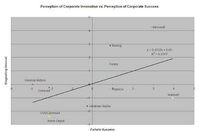
The coefficient of determination that represents the relationship between Innovation and Success is seen to be 0.2377. This is a lot lower than the first correlation that we looked at, Knowledge and Success. This is a relatively weak indication of correlation.

The reason that Innovation and Success may not be as strongly correlated is due to the fact that there is no direct link between Innovation and Success. Companies can be unbelievably innovative, developing new ideas everyday, but those ideas may not convert into revenue and ultimately profit.

In this scenario, there are companies that are seen as highly successful, Walmart and PepsiCo, but are stagnating at the same time. This is very accurate, especially when you look at the case of Walmart. While I would contend that Walmart's processes and supply chain integration are some of the most innovative in the world, as far as their product is concerned (consumer goods) they are relatively the same. This doesn't mean for one instant, however, that they are losing any bit of revenue or being any less of a successful company.
  • Ethics - Success
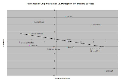
The coefficient of determination representing the relationship between corporate Ethics and Success was a disappointing 0.0811. This is a very weak correlation.

By looking at the chart, you can see that the companies are generally spread out showing no real signs of following any sort of linear relationship. This ultimately leads to a weak coefficient of determination.

You may also notice that even though the coefficient of determination is weak, the linear trend actually has a negative slope, indicating that the more successful a company is perceived to be the more evil it becomes. When one stands back and thinks about this correlation, it tends to make sense logically.

Consider highly successful companies; Walmart (#1 Fortune 500 List), Nike (Top Shoe Sales in the World), and Coke (#1 Soft Drink in the World). While all of these companies are considered extremely successful, they are also often questioned for their ethics and morality when it comes to how they treat their workers, smaller distributors, etc. Therefore, even though the trend isn't strong it makes sense.
  • Innovation - Knowledge
The coefficient of determination representing the relationship between a company's Innovation and Knowledge was the strongest, 0.6436. This is our highest correlation and well within the bounds proposed by Duke University.

Similar to our scenario of Knowledge - Success, companies are generally found within the First and Third Quadrant, indicating a link between innovation and knowledge and stagnation and ignorance.

Similar to our other scenarios, just by thinking about these two criteria logically it clearly makes sense that there would be a strong correlation between them. Companies that have a lot of knowledge probably have the ability to innovate well. At least, one's perception of corporate knowledge must lead to a belief in that company's ability to innovate.

The reverse is also true. Companies that innovate are probably thought to be very knowledgeable about their particular field, because they can continually adapt and work out new possibilities with it.
  • Conclusion
The object of this survey was to determine the relationship of various diametrically opposed criteria that included: Success and Failure, Knowledge and Ignorance, Innovation and Stagnation, and Good and Evil. Respondents were asked to rank the 10 companies in this survey on a continuum in which they were later assigned a point value. These point values were then averaged and then plotted against one another.

Regression analysis was performed in order to evaluate coefficients of determination. The coefficient of determination indicated a value between 0 and 1, 0 being least determinant and 1 being most determinant.

Based on the findings of this survey, the correlation between Knowledge and Innovation was highest, 0.6436. This was then followed by Knowledge and Success, 0.603. These two figures meet our Duke University criteria of being greater than or equal to 50% and can be considered legitimate correlations.

Our two other studies, Ethics and Success, 0.0811, and Innovation and Success, 0.2377, fall short of the generally accepted standard, and therefore, I cannot deduce any sort of correlation between these two criteria aside from logic.

Overall, I thought this was a really interesting and enjoyable study to perform. I was surprised at how well the results actually turned out. I feel like I learned a lot about companies and some ways in which they relate.